dv_says
Joined 11 years ago
Karma
280
Submissions
40
Member since
Apr 28
dv
View on Hacker NewsJoined 11 years ago
Was very happy to see this recent post from Pinterest [1] as a sign that some of the more "mainstream" teams are starting to look at it.
Also, a repost [2] of some helpful tips if you're just getting started.
[1] https://engineering.pinterest.com/blog/introducing-new-open-...
aws s3 sync --delete [--acl public-read] ...For example, this could have helped in [1][2][3] where toxic food products were very mislabeled.
[1] https://en.wikipedia.org/wiki/2008_Chinese_milk_scandal
It would have been interesting to be "a fly on the wall" and see how some of these evolved over time. I suspect some of the oddities initially started with a good set of screens, but then a new piece was later tacked on without a full audit or without the resources to change everything else.
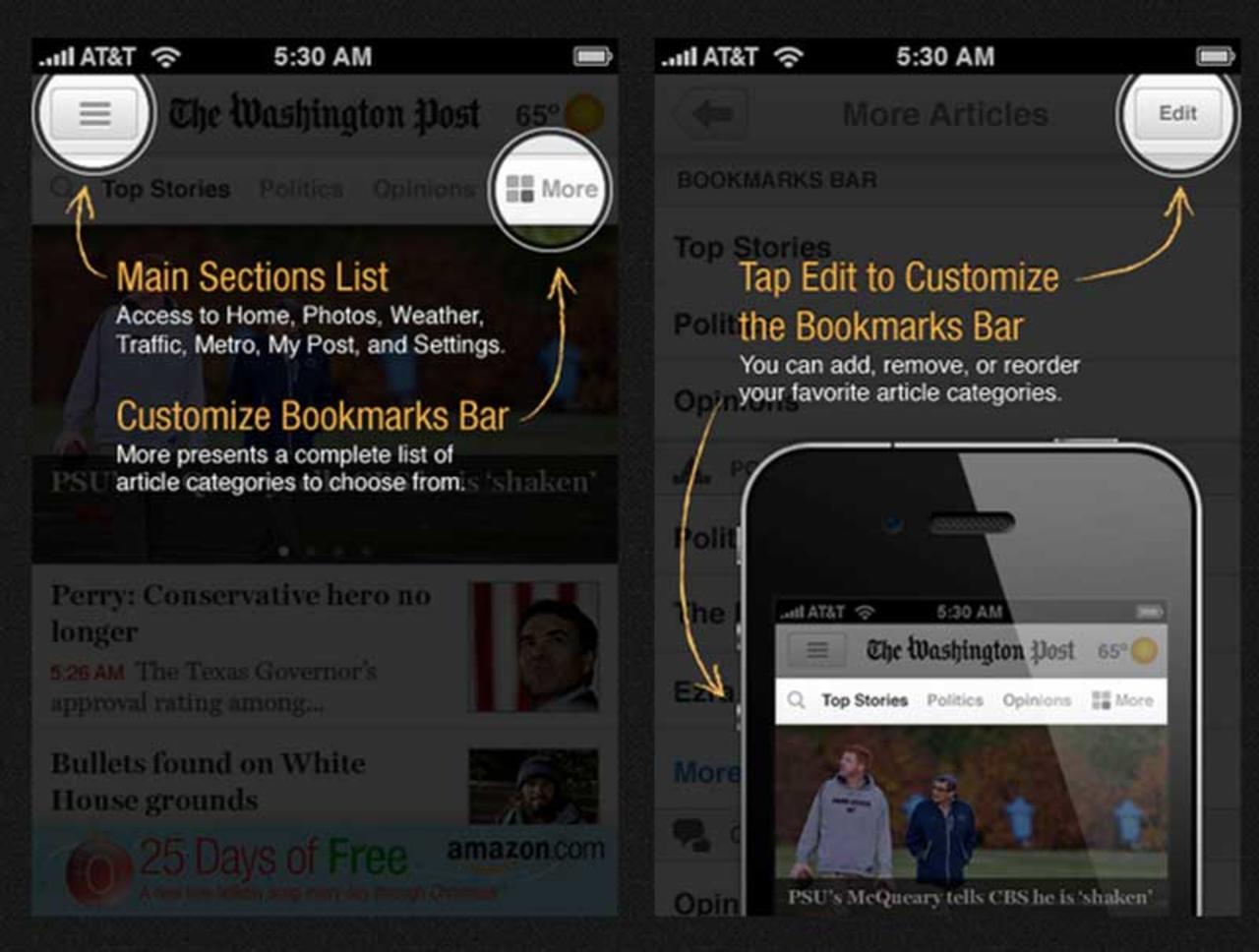
The problem with forced screen of tooltips in the very beginning is that you haven't had a chance to explore the app yet, and so it's hard to mentally assign importance to them. And later, they're gone.
Actual games (such as GTA or Cut the Rope) do a great job with onboarding, and apps tend to take the simpler show-everything-in-the-beginning way.
Two alternatives I've tried as an indie dev:
- Gamification, where you ask the user to perform one task, such as "drag X to Y." Only after they performed the action move on to the next prompt, and perhaps not even immediately.
- Utilizing badge counts or "bouncing" animations to indicate some action that needs to be performed. The benefit is that the user can try it on their own time, and you're not rushing them. The downside, though, is that some users may never actually click.
On the flip side, these approaches can add complexity in both code and how you structure your UI.
[1] http://s3.amazonaws.com/marquee-test-akiaisur2rgicbmpehea/R9...