graypegg
Joined 4 years ago
Karma
4,970
Submissions
1,450
Member since
Apr 6
Red panda furry person
View on Hacker NewsJoined 4 years ago
You can put hundreds of hours into these accounts, and people will roll the dice on a vibecoded plugin they (or a stranger on the runelite plugin repo) make with very little understanding that Jagex (the company that maintains OSRS) just sees client commands. If you look like a bot and smell like a bot, you get treated like a bot.
I now know two friends that got bans (one permanent!) for rolling their own unpublished plugins, not realizing that they asked Mod Claude for a macro set for some bossing content… oof.
The main difference is going to be scale and the chaos that brings. You see a LOT of streetcars in Toronto. For a huge chunk of downtown, it's the main subway-ish transit option. Some of the lines are on a 5min frequency, others are every ~10min or so, with some segments having 2-3 lines on it. I've seen them get backed up before an intersection, and open doors for passengers before they even reach the stop haha. I've personally hood-surfed over cars that got into the lane between the streetcar and the stop quite a few times, and sometimes it really isn't their fault.
The signal on the rear-end [1] is awful. There's a blurb saying "DO NOT PASS OPEN DOORS" which is clear enough, but there's also a sign that illuminates when the doors are open and it's NOT a stop sign. It's this do-not slashed circle with a picture of a stick figure seemingly walking into traffic. I think there's a reading of that symbol from well-meaning tourists that says "Attention boarding passengers, don't run into traffic". I could see that freaking out a waymo without a little bit of custom code.
[0] (All red lines are streetcars) https://cdn.ttc.ca/-/media/Project/TTC/DevProto/Images/Home/...
[1] https://blogto-production2-baselayer-display.blogto.com/arti...
But also... I know I have the minority opinion on this. It absolutely should be opt-in, not opt-out. I think the past decade, I've been told the font tweaks I enable are incomprehensable to everyone I work with. The way I like my IDE fonts is far outside the bell curve (ligatures, cursive variants for some syntax, proportional variants for prose) so the fact that most new monospace code-focused fonts seem to align with my opinions should be concerning to font makers! I like that I don't have to patch a different font's italics into my code font anymore, but common sense says I SHOULD still have to do that!
It's a really nice speaker if I set it on something sturdy that won't rattle, and airplay is still pretty good even on ancient devices.
I can't keep it plugged in because it will just randomly say "You can enable personalized responses in the settings app!" at 3am about once a week if I do. It's horrifying when it happens because it always seems to be 10x louder than I remember it being set to.
What if [positive noun] instead of [negative noun]? Have you ever thought about that? [Nefarious proper noun] tries to feed us [negative noun] but using [url] we're going to change the [collective noun]! [Collective noun in which the reader self-includes] has always been at the forefront of [positive adjective] innovation, and that has inspired me [artisanal synonym for "to make"] with love for you all.
You really need more than "new time bad... remember old time?" to pitch a general-purpose social media product that avoids the obvious, well-documented foibles of social media.
I'd call it an "ASCII-Art inspired shader", but some % of people would look at it and immediately call it "ASCII Art" with no confusion. Some other % of people are also going to scoff at me saying it's "ASCII-Art inspired" at all.
Should mention, I have no issue with this little project! I'm just agreeing with the parent comment that this is just hinting at the limitations of ASCII art without actually working with them, in our opinion. Thinking about art being an important step in appreciating art, and all of that.
"Being constructed of text characters" is a very loose definition of ASCII art. Not to say it's not visually interesting, but just that it's on the far ends of the histogram of what people think of when they hear "ASCII art".
Personally, I think the fact this is relying on colour for contrast makes this feel more like a shader that quantizes the input into little dots that just happen to be 1 of 3 characters, than ASCII Art. It's a vague border between that and an ASCII shader, and then ASCII art, but there's definitely some measureable distance between those peaks.
Though I think you're right that it's alphabetical by English name: Arabic, Chinese, French, Russian, Spanish
Archive link for context in the future: https://archive.is/g6Znd
But seriously, just publishing OAS docs at a /.well-known URI seems very sensible. https://www.rfc-editor.org/rfc/rfc9727.html
I don't think the agents are struggling with the idea that different URLs have different responses, and that checking the sitemap is a good idea.
Tangential: A rare en–dash user out in the wild!
I know this is pedantic, but IMO that should just be in the URL if the resource is going to be totally different. Accept-Language is already a bit weird for the same reason in my mind, but I think the intention behind it is the resource itself is attempting to communicate the exact same resource. Obviously, two different languages from two different cultures are going to have different interpretations of the same direct translation, but the intention is the service has at least tried to avoid that as much as possible.
Adding programming language into that same concept just makes it seems like you're serving both /docs/typescript/vx/... and /docs/python/vx/... from /docs/vx/... despite them (in theory) having many more differences in between implementations/context than that would imply.
Agents should read sitemaps. Does anyone's harness do specifically that when looking up documentation?
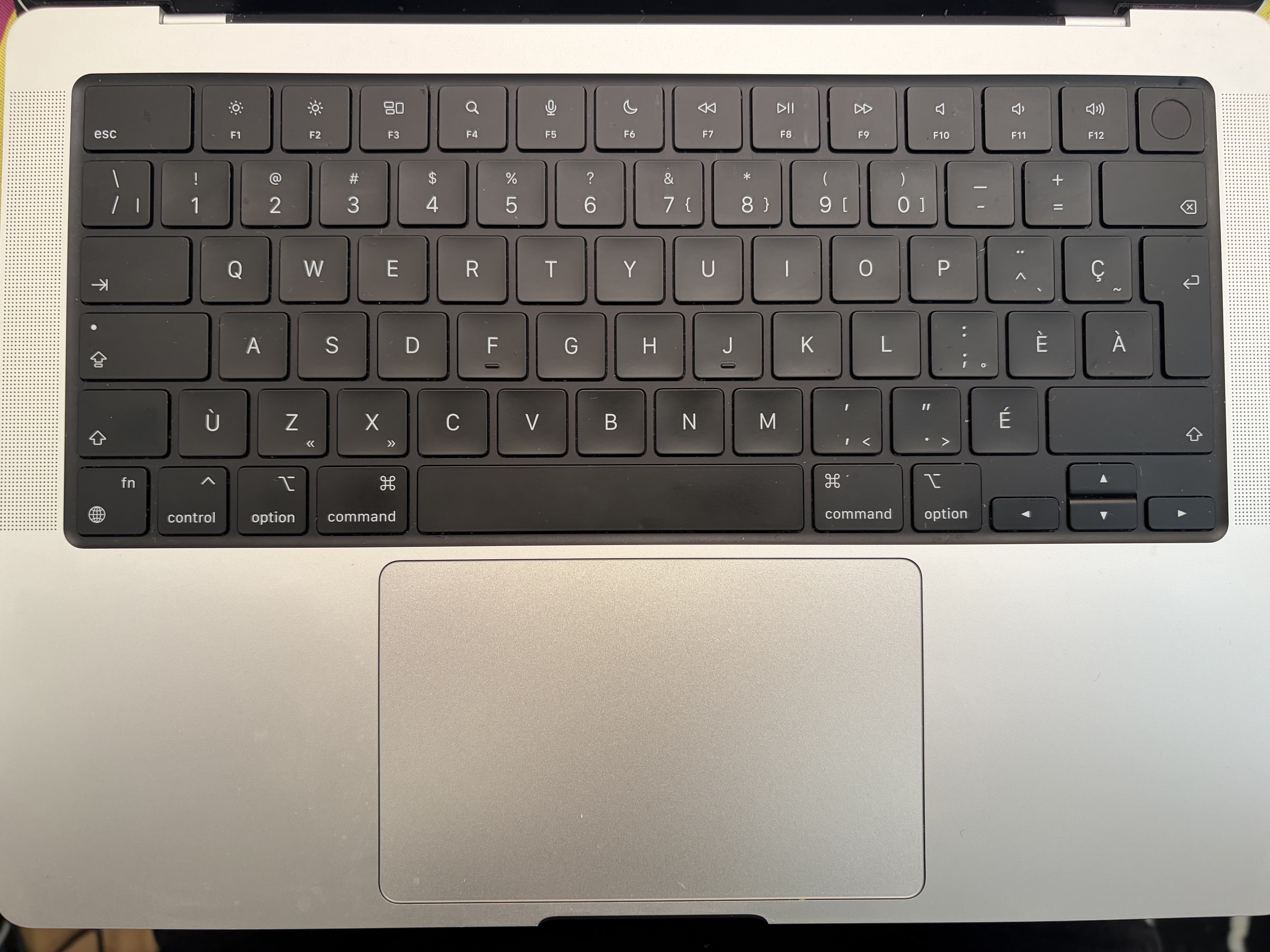
https://f.toi.sh/fr-ca-mbp.jpg (Pardon the dust!! You never really look too closely as your keyboard until you have to take a picture of it eh?)
Tab, capslock, shift, backspace, and return are all symbols-only. I feel like I have a pretty good ambient understanding of what they mean at a glance so I think I've always seen them on fr-CA layouts I've used.
Was trying to communicate to a designer in Ontario a while ago that we could use the backspace symbol for a correction key in a PIN entry view. We were working on an iOS application so I was immediately thinking that the apple default UI font would have exactly that "chevron with a cross" symbol styled how it looks on the keyboard somewhere in it. Designer was pretty confused about it though, so I think it's probably just fr-CA keyboards.